- ブログメニュー
- 3月の活動記録
3月の活動記録
AfterEffectsでも使うベジェ曲線
AfterEffects
AfterEffectsでもペンツールは使うんですね。 とっさの時に、必要になるので補完しときます。
企画

企画
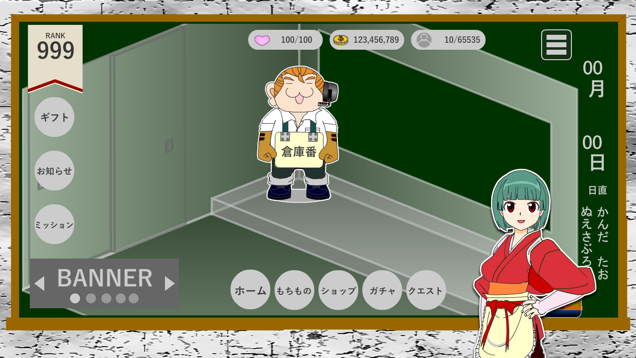
架空のケーブルテレビ局でアニメチャンネルをアピールするWEBサイトをつくる。
- Paizaのようなユーザー参加型のインタラクティブなサイトを目指す
- 最低限の素材とコード(レトロゲーム)を提供する。
- ユーザーが素材(画像サイズ指定あり)やコードを改変することが可能。チート上等。
- ユーザーはヒーローサイドとヴィランサイドを選択してロールプレイする。
- ゼルダの伝説は、本編よりもクラフト機能を駆使して別ゲーとしてユーザーが多発している。
- デベロッパーは、放送開始時間10分前まで専用サイトからアップロード手続きが完了している。
- プレイヤーは、放送開始から放送終了までの時間で新作ゲームの最高得点を叩き出したプレイヤーに番組終了後のミニコーナーのCM権(企画 or 投票)を与える。
Premiere Proを最低限利用する方法
Premiere Pro
Premiere Pro2026を最低限活用する方法
動画の流れ
VOICEVOX:春日部つむぎ
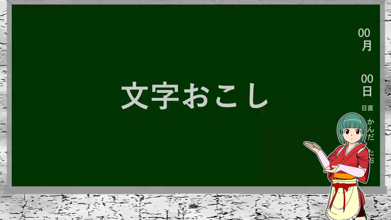
文字おこし
動画の音声を自動的に文字にしてくれる便利な機能。
モザイク
映像に写してはいけない者は画像処理で写さないようにしましょう。
エフェクトの基本操作
- 01 顔をワイプにしたい
-
- エフェクトコントロールパネルから透明度を選択
- 楕円形マスクツールを選択して描画範囲を指定
- エフェクトコントロール → モーションで位置を調整する
- 02 顔をワイプにしたい(境界線をつける)
-
- 【レイヤーの並び順】
- 【V3】V2をコピーする。境界線の枠線を描くグラフィック
- 【V2】グラフィックで切り抜きたい範囲を囲む
- 【V1】切り抜く写真 トラックマットキーを適用し、マット項目でビデオ2を選択する
最後にV1、V2、V3のレイヤーをネストする。
Premiere Pro エフェクト一覧
Adobe公式サイト- Lumetriプリセット
- オーディオエフェクト
- オーディオトランジション
- ビデオエフェクト
- Blur & Sharpen(ブラー&シャープ)
- Color Correction(カラー補正)
- Image Control(イメージコントロール)
- Keying(キーイング)
特定の「色」や「明るさ」の情報を元に、映像素材の一部を透明にして背景と合成する手法 - Lights & Glows(ライトとグロー)
- Perspective(遠近)
- Stylize(スタイライズ)
- Transform(変形)
- Utility(ユーティリティ)
- イマーシブビデオ
360度動画やVR技術を活用し、観客が映像の世界に入り込んだような「没入感」を体験できる映像技術 - イメージコントロール
- カラー補正
- キーイング
- スタイライズ
- ビデオトランジション
- レガシー
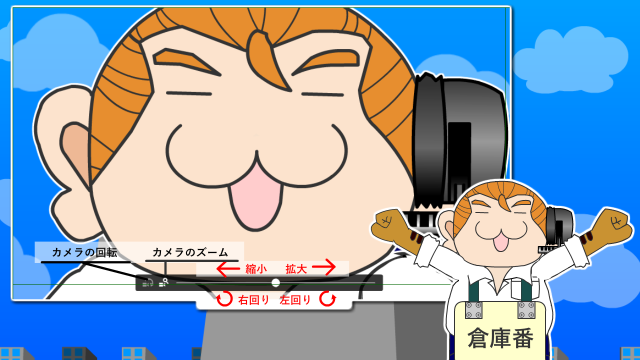
Animateのカメラ機能
Animate
Animateのカメラ機能
参考動画
- カメラ基本機能
-
- カメラのズーム
- カメラの回転
- 【注意】修正メニュー → ドキュメント → 「コードなレイヤーを使用」にチェック
- カメラワーク
-
- F6でキーフレームを追加し、指定の場所を拡大表示する。
- レイヤー接続/接続解除
-
- すべてのレイヤーをカメラに接続、または接続解除

- レイヤー深度
-
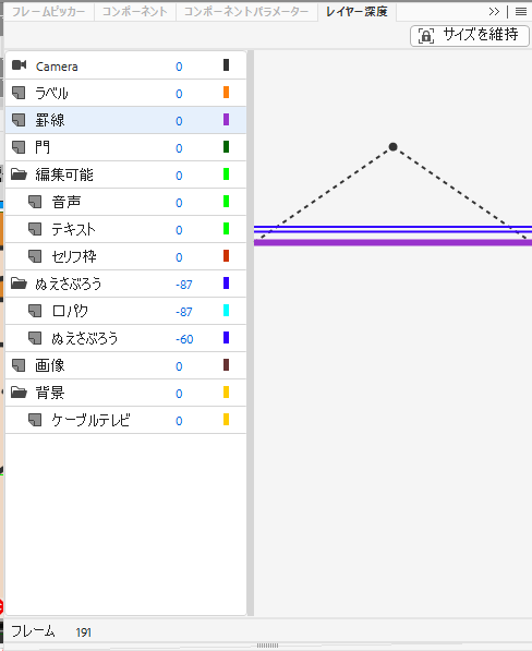
- レイヤー深度を適用することで、パララックス効果をもたらすことができる。
- パララックス効果(視差効果)は、Webサイトの背景と前景を異なる速度でスクロールさせ、奥行きや立体感を演出する手法です。
手前の要素は速く、背景の要素はゆっくり動くことで、2D画面に3Dのような奥行きが生まれる。 - <注意>必ず右上の「サイズを維持」を適用することを忘れないようにする!
ゲームアルゴリズム
アルゴリズム
【参考書籍】7大ゲームのつくりかたを完全マスター!ゲームアルゴリズムまるごと図鑑
正誤情報
- P.90 ソースコード「複数の弾を一度に放つ関数」5行目
-
- 誤 | ssY-n*6+i*12-40
- 正 | ssY-n*6+i*12, 40
- P.192 ソースコード「ボールを描く関数を追加」1行目
-
- 誤 | unction
- 正 | function
7つのゲーム
基本
- ヒットチェック
- 2つの物体の接触を調べる方法。当たり判定、接触判定、コリジョンとも言う。
- ソート
- データをある順番に並べ替えるアルゴズムのこと。
- サーチ
- 複数のデータの中から目的の値を探すこと。
変数名の付け方
- アルファベットとアンダースコア(_)を組合わせて任意の名称にできる。
- 数字を含めることができるが、頭文字に数字を使ってはならない。
- 予約語を使用してはならない。
条件分岐
- 条件式
- 論理和 / 論理積
- switch case
- 繰り返し(ループ)
- whileによる繰り返し
- do { 処理 } while(条件式);
- 関数
- 配列
- 二次元配列
スカッシュゲーム
段階的にプログラムを組み込む
- 背景画像を読み込んでコートを表示する
- ボールを壁で跳ね返らせる
- マウス操作でバーを左右に動かす
- バーでボールを打ち返す
- ボールを逃したらゲームオーバー
変数名
| 変数名 | 初期値 | 用途 |
|---|---|---|
| ballX | ||
| ballY | ||
| ballXp | ||
| ballYp | ||
| barX | ||
| barY | ||
| score | ||
| scene |
//起動時の処理
function setup() {
    canvasSize(1200, 800); //画面サイズ
    lineW(3); //図形の線の太さを指定
    loadImg(0, "image/bg.png"); //背景画像を読み込む
}

//メインループ
function mainloop() {
    drawImg(0, 0, 0); //背景画像
    setAlp(50); //透明度を指定(50%)
    fRect(250, 50, 700, 750, "black"); //塗りつぶし座標(250,50) 幅700px 高さ750px 背景:黒
    setAlp(100); //透明度を100%に戻す
    sRect(250, 50, 700, 760, "silver"); //座標(250,50) 幅700px 高さ760px 線:銀
}
テキストアニメーション
スクリプト
最低限覚えておきたいあらわれかた
BOUNCE
| プロパティ | 要素 |
|---|---|
| animate__infinite | 無限ループさせたい場合 |
| animation-iteration-count:2; | 回数を自分で決めたい場合 |
| animation-delay:0.5s; | 1秒から5秒遅らせたい場合 |
| animate__slow | 遅い~速いまでの4段階の変化 |
HTML
/*bound*/
<div class="test_parent">
  <div class="animate__animated animate__bounce test_txt">BOUNCE</div>
<!--/.js_display .test_parent--></div>
ふわっ(その場で)
- ふわっ
- ふわっ
- ふわっ
- ふわっ
HTML
<div class="test_txt">
  <span class="fadeIn">ふわっ</span>
</div>
CSS
.fadeIn{
  display:block;
  animation-name:fadeInAnime;
  animation-duration:3s;
  animation-fill-mode:forwards;
  animation-iteration-count:infinite;
  opacity:0;
}
@keyframes fadeInAnime{
  from{
    opacity:0;
  }
  to{
    opacity:1;
  }
}
パタッ
-
パタッ
-
パタッ
-
パタッ
-
パタッ
-
パタッ
HTML
<ul class="flip_list">
              <li>
                <div class="flip">
                  <div class="flipDown">パタッ</div>
                <!--/.flip--></div>
              </li>
              <li>
                  <div class="flip">
                    <div class="flipLeft">パタッ</div>
                <!--/.flip--></div>
              </li>
              <li>
                  <div class="flip">
                    <div class="flipLeftTop">パタッ</div>
                <!--/.flip--></div>
              </li>
              <li>
                  <div class="flip">
                    <div class="flipRight">パタッ</div>
                <!--/.flip--></div>
              </li>
              <li>
                  <div class="flip">
                    <div class="flipRightTop">パタッ</div>
                <!--/.flip--></div>
              </li>
            </ul>
CSS
.flip_list{
  display:flex;
  flex-wrap:wrap;
  justify-content: center;
  position:relative;
}
.flip{
  display:block;
  width:100px;
  line-height:80px;
  font-size:2.0rem;
  transform:translate3d(0, 0, 0);
}
.flipDown{
  width:100px;
  height:100px;
  padding:0.5em;
  border:2px solid #000;
  animation-name:flipDownAnime;
  animation-duration:3s;
  animation-fill-mode:forwards;
  animation-iteration-count:infinite;
  animation-direction:alternate;
  opacity:0;
  position:absolute;
}
@keyframes flipDownAnime{
  from{
    transform:perspective(2500px) rotateX(100deg);
    opacity:1;
  }
  to{
    transform:perspective(2500px) rotateX(0);
    opacity:1;
  }
}
.flipLeft{
  width:100px;
  height:100px;
  padding:0.5em;
  border:2px solid #000;
  animation-name:flipLeftAnime;
  animation-duration:3s;
  animation-fill-mode:forwards;
  animation-iteration-count:infinite;
  animation-direction:alternate;
  opacity:1;
  position:absolute;
}
@keyframes flipLeftAnime{
  from{
      transform:perspective(600px) translate3d(0,0,0) rotateY(60deg);
      opacity:1;
  }
  to{
    transform:perspective(600px) translate3d(0,0,0) rotateY(0deg);
    opacity:1;
  }
}
.flipLeftTop{
  width:100px;
  height:100px;
  padding:0.5em;
  border:2px solid #000;
  animation-name:flipLeftTopAnime;
  animation-duration:3s;
  animation-fill-mode:forwards;
  animation-iteration-count:infinite;
  animation-direction:alternate;
  opacity:1;
  position:absolute;
}
@keyframes flipLeftTopAnime{
  from{
    transform:translate(-20px, 80px) rotate(-15deg);
  }
  to{
    transform:translate(0, 0) rotate(0deg);
  }
}
.flipRight{
  width:100px;
  height:100px;
  padding:0.5em;
  border:2px solid #000;
  animation-name:flipRightAnime;
  animation-duration:3s;
  animation-fill-mode:forwards;
  animation-iteration-count:infinite;
  animation-direction:alternate;
  opacity:1;
  position:absolute;
}
@keyframes flipRightAnime{
  from{
      transform:perspective(600px) translate3d(0,0,0) rotateY(-30deg);
      opacity:1;
  }
  to{
    transform:perspective(600px) translate3d(0,0,0) rotateY(0deg);
    opacity:1;
  }
}
.flipRightTop{
  width:100px;
  height:100px;
  padding:0.5em;
  border:2px solid #000;
  animation-name:flipRightTopAnime;
  animation-duration:3s;
  animation-fill-mode:forwards;
  animation-iteration-count:infinite;
  animation-direction:alternate;
  opacity:1;
  position:absolute;
}
@keyframes flipRightTopAnime{
  from{
    transform:translate(-20px, 80px) rotate(25deg);
  }
  to{
    transform:translate(0, 1) rotate(0deg);
  }
}
クルッ
-
くるっX軸
-
くるっY軸
-
くるっZ軸
-
くるっZ軸
CSS
.rotateX{
  width:100px;
  height:100px;
  line-height:80px;
  padding:0.5em;
  border:2px solid #000;
  animation-name:rotateXAnime;
  animation-duration:3s;
  animation-fill-mode:forwards;
  animation-iteration-count:infinite;
  animation-direction:alternate;
}
@keyframes rotateXAnime{
  from{
    transform:rotateX(0);
  }
  to{
    transform:rotateX(-360deg);
  }
}
.rotateY{
  width:100px;
  height:100px;
  line-height:80px;
  padding:0.5em;
  border:2px solid #000;
  animation-name:rotateYAnime;
  animation-duration:3s;
  animation-fill-mode:forwards;
  animation-iteration-count:infinite;
  animation-direction:alternate;
}
@keyframes rotateYAnime{
  from{
    transform:rotateY(0);
  }
  to{
    transform:rotateY(-360deg);
  }
}
.rotateZ{
  width:100px;
  height:100px;
  line-height:80px;
  padding:0.5em;
  border:2px solid #000;
  animation-name:rotateZAnime;
  animation-duration:3s;
  animation-fill-mode:forwards;
  animation-iteration-count:infinite;
  animation-direction:alternate;
}
@keyframes rotateZAnime{
  from{
    transform:rotateZ(0);
  }
  to{
    transform:rotateZ(-360deg);
  }
}
.rotateRightZ{
  width:100px;
  height:100px;
  line-height:80px;
  padding:0.5em;
  border:2px solid #000;
  animation-name:rotateRightZAnime;
  animation-duration:3s;
  animation-fill-mode:forwards;
  animation-iteration-count:infinite;
  animation-direction:alternate;
}
@keyframes rotateRightZAnime{
  from{
    transform:rotateZ(0);
  }
  to{
    transform:rotateZ(360deg);
  }
}
ボンッ(拡大)
-
ボンッ
-
ボンッ
HTML
<ul class="animation_scale_list">
<li><div class="zoomIn">ボンッ</div></li>
<li><div class="zoomOut">ボンッ</div></li>
</ul>
CSS
.zoomIn{
  width:100px;
  height:100px;
  line-height:80px;
  padding:0.5em;
  border:2px solid #000;
  animation-name:zoomInAnime;
  animation-duration:3s;
  animation-timing-function:ease-in-out;
  animation-fill-mode:forwards;
  animation-iteration-count:infinite;
  animation-direction:alternate;
}
@keyframes zoomInAnime{
  from{
    transform:scale(0.6);
  }
  to{
    transform:scale(1);
  }
}
.zoomOut{
  width:100px;
  height:100px;
  line-height:80px;
  padding:0.5em;
  border:2px solid #000;
  animation-name:zoomOutAnime;
  animation-duration:3s;
  animation-timing-function:ease-in-out;
  animation-fill-mode:forwards;
  animation-iteration-count:infinite;
  animation-direction:alternate;
}
@keyframes zoomOutAnime{
  from{
    transform:scale(1.2);
  }
  to{
    transform:scale(1);
  }
}
じわっ(ぼかしから出現)
-
じわっ
CSS
.blurAnime{
  width:100px;
  height:100px;
  line-height:80px;
  padding:0.5em;
  border:2px solid #000;
  animation-name:blurAnime;
  animation-duration:3s;
  animation-timing-function:ease-in-out;
  animation-fill-mode:forwards;
  animation-iteration-count:infinite;
  animation-direction:alternate;
}
@keyframes blurAnime{
  from{
    filter:blur(10px);
    transform:scale(1.02);
  }
  to{
    filter:blur(0);
    transform:scale(1);
  }
}
にゅーん(滑らかに変形して出現)
-
にゅーん
CSS
.smooth{
  width:100px;
  height:100px;
  line-height:80px;
  padding:0.5em;
  border:2px solid #000;
  animation-name:smoothAnime;
  animation-duration:3s;
  animation-timing-function:ease-in-out;
  animation-fill-mode:forwards;
  animation-iteration-count:infinite;
  animation-direction:alternate;
}
@keyframes smoothAnime{
  from{
      transform:translate3d(0,100%,0) skewY(12deg);
  }
  to{
      transform:translate3d(0,0,0) skewY(0);
  }
}
スーッ(枠線が伸びて出現)
-
スーッ
CSS
/*スーッ*/
.line_width{
  position:relative;
}
.line_width::before,
.line_width::after{
  content:"";
  width:0;
  height:1px;
  background:#333;
  position:absolute;
}
.line_width::before{
  top:0;
  left:0;
  animation:line_widthAnime .5s linear 0s infinite alternate forwards;
}
.line_width::after{
  bottom:0;
  right:0;
  animation:line_widthAnime .5s linear 1s infinite alternate forwards;
}
@keyframes line_widthAnime{
  0%{
    width:0%;
  }
  100%{
    width:100%;
  }
}
.line_height{
  width:100px;
  height:100px;
  line-height:80px;
  padding:0.5em;
  box-shadow: 2px 2px 10px #CCC;
  animation-name:line01Anime;
  animation-timing-function:ease-in-out;
  animation-fill-mode:forwards;
  animation-iteration-count:infinite;
  animation-direction:alternate;
}
.line_height::before,
.line_height::after{
  content:'';
  width:1px;
  height:0;
  background:#333;
  position:absolute;
}
.line_height::before{
  content:'';
  top:0;
  right:0;
  animation:line_heightAnime .5s linear 1s infinite alternate forwards;
}
.line_height::after{
  content:'';
  bottom:0;
  left:0;
  animation:line_heightAnime .5s linear 1.5s infinite alternate forwards;
}
@keyframes line_heightAnime{
  0%{
    height:0%;
  }
  100%{
    height:100%;
  }
}
.line_width span .lineinappear{
  animation:lineInnerAnime .5s linear 1.5s infinite alternate forwards;
  opacity:0;
}
@keyframe lineInnerAnime{
  0%{
    opacity:0;
  }
  100%{
    opacity:1;
  }
}
シャ(背景色が伸びて出現)
CSS
背景色が伸びて出現
.bgextend{
  width:100px;
  height:100px;
  padding:0;
  border:1px solid #000;
  box-shadow: 2px 2px 10px #CCC;
  color:#000;
  position:absolute;
  top:50%;
  transform:translateY(-50%);
  animation-name:bgextendAnimeBase;
  animation-timing-function:ease-in-out;
  animation-fill-mode:backwards;
  animation-iteration-count:infinite;
  animation-direction:normal;
}
@keyframes bgextendAnimeBase{
  from{
    opacity:0;
  }
  to{
    opacity:1;
  }
}
.bgextend a{
  display:block;
  width:100px;
  height:100px;
  line-height:100px;
  color:#000;
  text-align:center;
}
.bgextend a:hover{
  color:#E5DECA;
}
.bgappear{
  width:100px;
  height:100px;
}
.bgLRexend:hover::before{
  content:"";
  width:100%;
  max-width:100px;
  height:100%;
  max-height:100px;
  background:#7E9374;
  color:#E5DECA;
  position:absolute;
  animation-name:bgLRexendAnime;
  animation-duration:1s;
  animation-timing-function:ease-in-out;
  animation-fill-mode:backwards;
  animation-iteration-count:infinite;
  animation-direction:normal;
}
@keyframes bgLRexendAnime{
  0%{
    transform-origin:left;
    transform:scaleX(0);
  }
  50%{
    transform-origin:left;
    transform:scaleX(1);
  }
  50.001%{
    transform-origin:right;
  }
  100%{
    transform-origin:right;
    transform:scaleX(0);
  }
}
.bgRLexend:hover::before{
  content:"";
  width:100%;
  max-width:100px;
  height:100%;
  max-height:100px;
  background:#7E9374;
  color:#E5DECA;
  position:absolute;
  animation-name:bgRLexendAnime;
  animation-duration:1s;
  animation-timing-function:ease-in-out;
  animation-fill-mode:backwards;
  animation-iteration-count:infinite;
  animation-direction:normal;
}
@keyframes bgRLexendAnime{
  0%{
    transform-origin:right;
    transform:scaleX(0);
  }
  50%{
    transform-origin:right;
    transform:scaleX(1);
  }
  50.001%{
    transform-origin:left;
  }
  100%{
    transform-origin:left;
    transform:scaleX(0);
  }
}
.bgDUexend:hover::before{
  content:"";
  width:100%;
  max-width:100px;
  height:100%;
  max-height:100px;
  background:#7E9374;
  color:#E5DECA;
  position:absolute;
  animation-name:bgDUexendAnime;
  animation-duration:1s;
  animation-timing-function:ease-in-out;
  animation-fill-mode:backwards;
  animation-iteration-count:infinite;
  animation-direction:normal;
}
@keyframes bgDUexendAnime{
  0%{
    transform-origin:bottom;
    transform:scaleY(0);
  }
  50%{
    transform-origin:bottom;
    transform:scaleY(1);
  }
  50.001%{
    transform-origin:top;
  }
  100%{
    transform-origin:top;
    transform:scaleY(0);
  }
}
.bgUDexend:hover::before{
  content:"";
  width:100%;
  max-width:100px;
  height:100%;
  max-height:100px;
  background:#7E9374;
  color:#E5DECA;
  position:absolute;
  animation-name:bgUDexendAnime;
  animation-duration:1s;
  animation-timing-function:ease-in-out;
  animation-fill-mode:backwards;
  animation-iteration-count:infinite;
  animation-direction:normal;
}
@keyframes bgUDexendAnime{
  0%{
    transform-origin:top;
    transform:scaleY(0);
  }
  50%{
    transform-origin:top;
    transform:scaleY(1);
  }
  50.001%{
    transform-origin:bottom;
  }
  100%{
    transform-origin:bottom;
    transform:scaleY(0);
  }
}
順番に現れる
CSS
出現
.fadeUp{
  animation-name:fadeUpAnime;
  animation-duration:3s;
  animation-fill-mode:forwards;
  animation-iteration-count:infinite;
  animation-direction:alternate;
  opacity:0;
  position:absolute;
}
@keyframes fadeUpAnime{
  from{
    opacity:0;
    transform:translateY(80px);
  }
  to{
      opacity:1;
      transform:translateY(0);
  }
}
.delay-time02{
  animation-delay:0.4s;
}
.delay-time03{
  animation-delay:0.8s;
}
.delay-time04{
  animation-delay:1.2s;
}
ランダムに現れる
背景の動き
背景色が時間により変化
- animation:flash 1s ease-in-out 0.5s infinite normal forwards running;
- animation:名前 変化時間 タイミング関数 遅延時間 繰り返し回数 再生方向 再生中・再生後のスタイル 再生状態
グラデーションが時間により変化
- animation:flash 1s ease-in-out 0.5s infinite normal forwards running;
- animation:名前 変化時間 タイミング関数 遅延時間 繰り返し回数 再生方向 再生中・再生後のスタイル 再生状態
CSS
/*グラデーションが時間時間により変化*/
.change_gradiation_background{
  width:100%;
  height:300px;
  background:linear-gradient(45deg,#3bade3,#9844b7,#44ea76);
  color:#FFFFFF;
  background-size:200% 200%;
  animation:bggradient 10s ease infinite alternate;
}
@keyframes bggradient{
  0%{
    background-position:0% 50%;
  }
  50%{
    background-position:100% 50%;
  }
  100%{
    background-position:0% 50%;
  }
}
流体シェイプ
流体シェイプ
CSS
/*流体シェイプ*/
.fluid{
  width:96%;
  height:300px;
  line-height:300px;
  margin:0 auto;
  background:#FFF100;
  font-size:4.0rem;
  text-align:center;
  animation:fluidrotate 30s ease 0s infinite alternate;
}
@keyframes fluidrotate{
  0%,100%{
    border-radius:63% 37% 54% 46% / 55% 48% 52% 45%;
  }
  14%{
    border-radius:40% 60% 54% 46% / 49% 60% 40% 51%;
  }
  28%{
    border-radius:54% 46% 38% 62% / 49% 70% 30% 51%;
  }
  42%{
    border-radius:54% 46% 38% 62% / 49% 70% 30% 51%;
  }
  56%{
    border-radius:61% 39% 67% 33% / 70% 50% 50% 30%;
  }
  70%{
    border-radius:50% 50% 34% 66% / 56% 68% 32% 44%;
  }
  84%{
    border-radius:46% 54% 50% 50% / 35% 61% 39% 65%;
  }
}
動画編集
動画編集
作業内容
- タイムラインを理解する
-
-
- クリップ
- 動画を構成する素材のこと
- トラック
- 素材を配置する場所
- クリップを選択する
-
全てのクリップをまとめて選択したい場合
すべてのクリップを覆うようにドラッグするか、CTRL+Aを押す。
クリップを複数選択する場合
shiftを押しながらクリック、または、選択したいクリップを囲むようにドラッグ
-
- エフェクトについて理解しよう
-
- エフェクトとは
- 映像や音声に加える効果のこと
- トランジション
- クリップとクリップの間に作用するエフェクト
- クロスディソルブ
-
- ビデオトランジション
- →→ Dissolve ※カタカナのディソルブとはことなるので注意
- →→ →→ Cross Dissolve
-
- カラー補正
-
- やや暗めのトーンの動画を明るくする方法
-
- タイムラインのクリップを選択し、【Lumetriスコープ】タブをクリック。
【Lumetriスコープ】パネルを右クリックして表示されたメニューの【波形】にチェックがついていることを確認し、
【波形】にチェックがついていることを確認し、
【波形タイプ】 → 【輝度】をクリック -
自動でカラーを調整する
クリップを選択し、画面右側の【Lumetriカラー】パネルの【基本補正】にある【自動】ボタンをクリック。
-
カラーを調整のパラメーター
- ホワイトバランス(スポイト)
- スポイントでクリックした箇所が「白の基準」であると認識され【色温度】【色かぶり補正】の値を自動的に調整する
- 色温度
- 暖色系/寒色系に調整する
- 色かぶり補正
- グリーン、マゼンダの値を調整して色かぶりを補正する
- 彩度
- 色の濃淡を調整する
- 露出光
- 全体の明るさを調整する
- コントラスト
- 明暗の強弱を調整する
- ハイライト
- 明るい部分を調整する
- シャドウ
- 暗い部分を調整する
- 白レベル
- もっとも明るい部分を調整する
- 黒レベル
- もっとも暗い部分を調整する
- タイムラインのクリップを選択し、【Lumetriスコープ】タブをクリック。
プロフィール
| 名前 | いとうともお |
|---|---|
| 仕事 | PCの修理受付・取扱説明書作成 |
| 好物 | 大豆食品 |
| スキル |
|